How to make a sticky header – code vs plugin
Sticky elements are slowly but surely becoming a common factor in website design. Most prominently, these are used for headers and menus but can also be used on virtually anything on your site. Since they are a surprisingly useful tool and not just a fad, it’s important to know what the sticky attribute is, when best to use it, and finally, how you can implement it in your site.
What does the “sticky” designation mean
Used for easier navigation, you can make elements on your page stick, as we’ve already explained. Making them stick means that the designated element won’t move from their original position on the page once you scroll up or down but instead stay in place. If you’ve ever used the “freeze panes” option in Excel, you’ll know exactly what we’re talking about since it is based on a very similar principle.
What elements benefit most from being “sticky.”
All of us have encountered these elements, so there is no real mystery on where to use the sticky attribute. These would be the ones you want your visitors to have access to every moment they’re browsing your site. As they’re always on the screen, it’s important to limit the sticky elements on the borders – usually the upper border for navigation (sticky header and sticky menu) or the bottom border for advertising or support (chat and contact information). Although not unheard of but still exceedingly rare, side borders (left and right) can also be used for either of the aforementioned functions.
The benefits of sticky elements
Even though it might sound contradictory (because they use up space on the screen), sticky elements actually save you space. Sure, the space reserved for content on your page is reduced; however, you don’t have to waste any of it on navigation. That means that the “body” of every page is reserved exclusively for your content. The space you save is and navigational hassle you avoid is even more prominent on phones and tablets that have smaller screens and overall fewer navigation capabilities. Having an ever-present section that can be used to move the switch from page to page instead of using the “back” button immensely enhances the browsing experience.
How to create/implement a sticky element
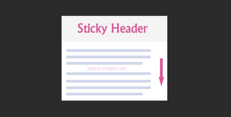
There are two main ways you can create sticky elements. You could do it manually through code, or you could use one of the numerous plugins designed to simplify the process. For our purposes, we’ll focus on the sticky header, by far the most common sticky element on pages.
Manual sticky header
To create a sticky header in WordPress manually, you’ll need to use CSS code. Putting it simply, CSS is code we add to the element (in this case, header) that alters its properties. This can be used in a variety of ways, ranging from the simplest, like applying a custom color, to the more advanced, like adding the targeted sticky attribute we’ve been talking about.
To access the console that lets you make these changes go to the appearance section find on the left-hand side of your dashboard. Once there, choose “customize” and click on “additional CSS”. Now you’ll be able to input the code that makes your header sticky:
#website-navigation {
background:#fff;
height:60px;
z-index:170;
margin:0 auto;
border-bottom:1px solid #dadada;
width:100%;
position:fixed;
top:0;
left:0;
right:0;
text-align: center;
}
By the time you’re done, the code should look like the one we’ve listed above. One thing that’s specific to each site is the first line – you’ll need to replace #website-navigation with your navigation header’s CSS class or ID.
Once you’ve finished, simply click on publish, refresh your site, and marvel at your brand-new sticky header.
Sticky header by the plugin
If you don’t have the time, knowledge, or inclination to dive into coding, there is always the option to use a plugin. One of the best we’ve found that will cover everything you need to create sticky elements and is, at the same time, very easy to use is WP Sticky. Right off the bat, we’ll point out that there is absolutely no coding needed; everything is done through the very user-friendly UI. The whole process is divided into three parts/sections – basic, visual, and advanced. Don’t let this fool you, as the steps are intuitive enough, and you won’t get befuddled along the way.
The first order of business is adding a sticky element. This is easily done by simply clicking the big yellow button aptly named “Add new sticky element”. You can add as many sticky elements as you want, so be sure to name them in a way you can follow easily. Since we’re showing how to create a sticky header, we’ll continue focusing on that.
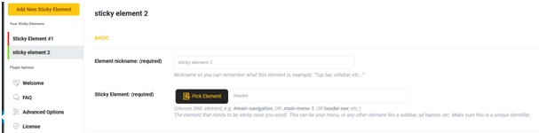
Now comes the fun part. Namely, adding elements to the “sticky pile” has never been easier. Simply add the nickname of your element (in this case, header) and choose the element. This choosing is the fun part. Namely, you get a preview of your page from the frontend and choose the element by just clicking on it. The chosen element is then converted to a sticky element – they couldn’t have made it easier if they tried.
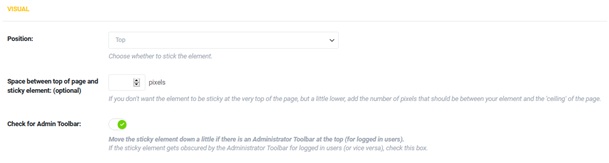
Now that you’ve made your sticky header, it’s time to customize it. Through the visual section, you can choose the position (if it’s a header, it fits naturally on top), the spacing between the element and the rest of the page, and take the admin toolbar into account.
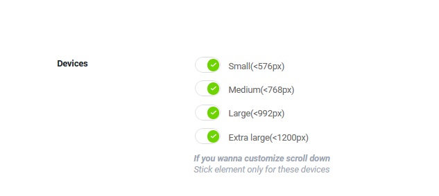
Furthermore, because there are so many browsing options available nowadays, you can make rules about the sticky element based on its displayed screen. Present are four default sizes to choose from that cover the basics – phone, tablet, and desktop. This feature is crucial in making your site responsive, something you simply can’t go without unless you invest in an app for phones that will accompany your site for desktop browsers.
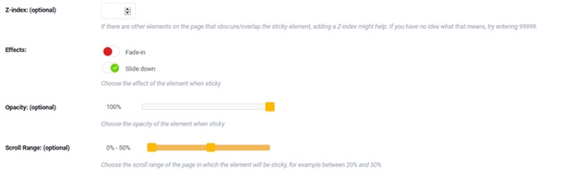
If you have many elements on a page, it’s important to keep your sticky header literally on top of them. This is usually the case by default; however, if you find that your header is obscured, just manually adjust the Z-index (if the number is higher, the header will always be on top). Additionally, you can choose to implement effects to your header, change the opacity and scroll range.
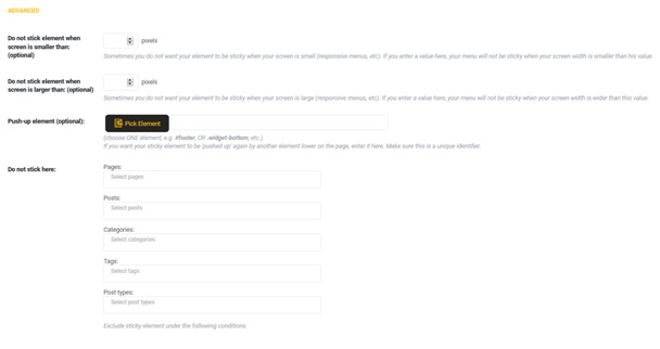
Finally, the advanced settings center mainly around exclusion with the addition of setting up an optional push-up element. Here you can expand upon the screen size your header will be sticky beyond the default sizes and make rules on which pages, posts, etc. the header will not be sticky. The whole process is as simple as just adding the numbers and categories to a few designated fields.
At the end of the process, it’s important to emphasize that while it may seem there are more steps to cover than manually writing a dozen lines of CSS code, it’s really a much simpler endeavor. The code is simple for those who know what they’re doing, and if you don’t, you may find yourself losing hours on other people’s code and YouTube tutorials. WP Sticky makes it so that you have to select a header on your page by clicking on it, check a couple of boxes, and fill in a couple of fields, essentially something any of us can do without much fuss.
Summary
There really isn’t much debate about which of the methods is better – it all depends on your coding skills. If you’re well versed with HTML and CSS coding, it’s a safe bet you’ll be able to churn out a functioning sticky header in no time. On the other hand, if you’re new to web management and rely on plugins to replace the required coding, then using WP Sticky is undoubtedly the better solution for you.